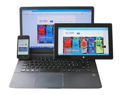
Small screens revolutionize web design
Responsive vs. Mobile websites
Do you know how your business website appears on mobile devices?
How important is it to have a website that functions as well on mobile devices as it does on laptops and desktop computers?
According to recent statistics from Pew Internet (June 26, 2012), 55% of adult cell phone owners in America use their phones to go online at least occasionally. The same study found that 31% of those cell phone Internet users go online almost exclusively using their cell phones - and that number is growing fast!
The convenience and portability promised by the first cellular phones, released in 1983, have finally been delivered by today's mobile devices that have features, coverage and even battery life that few could have imagined 30 years ago.
As cellular technology improved so did signal quality, making mobile phones more practical for regular use in an ever increasing number of locations around the world. Then came texting, GPS and data plans, smart phones and tablets with touch screens. Today a growing number of people rely solely on their mobile devices for phone calls and texting, business calendar, camera, games and books and access to the Internet.
Like it or not, mobile devices have arrived and they are here to stay.
So what can you do to ensure your website appeals to visitors (and search engines) no matter what device is used to access it?
There are two main schools of thought on this issue:
- Businesses should develop separate websites for desktop devices and mobile devices - including repurposed content and smaller pictures more suitable for mobile
- Businesses should develop websites that automatically reformat themselves depending on which device is being used. This is known as responsive website design
Mobile sites
Creating a separate website for mobile devices seems like the obvious answer for businesses that want to appeal to mobile users. With a dedicated mobile site, content, pictures and design are optimized for smaller screens and the interactive features of mobile devices, such as touch screens and click to call directly from a website. Having a dedicated mobile website can really benefit certain types of businesses where clients are most likely to want immediate and direct interaction for things like movie listings, restaurant reservations, book downloads and online ordering.
However, developing two websites raises the cost significantly, as well as increasing the amount of time required to properly update and maintain both sites.
Another consideration is that if you have two different websites, your 'link juice' will be divided between them, making both weaker in the eyes of the search engines. Back links are one of the most important factors that search engines like Google consider when ranking your website so you want to squeeze every possible bit of 'juice' out of those valuable links.
And just as important, users don't want to feel like they are missing something by using a stripped down version of the 'real' website.
What users want is the full website experience on any device they choose to use, whether that's a laptop, desktop, tablet or smart phone.
Responsive websites
As the name implies, responsive websites are built to automatically reformat themselves for particular devices. What happens is, the website developer sets up parameters that determine the layout of the web pages depending on the screen size. So the web page displays a certain way on your laptop, reformats itself when you bring it up on a tablet and then again when you access the same website on your smart phone. Responsive design even adapts to the horizontal or vertical orientation of your device.
Reformatting can involve a lot of different things: moving and truncating menus, hiding photos and changing text layout, for example.
There are many benefits to using responsive design, starting with the money and time you save by developing and maintaining one website, rather than two.
Responsive design is better for the search engines as it reduces duplicate content, doesn't dilute your link 'juice' and is preferred by Google.
One major downside of responsive websites is that the pages are often larger and load slower on mobile devices. Users expect pages to load quickly and won't wait around long if they don't. Web developers have to keep this in mind, taking advantage of new technology like HTML5 to design responsive websites that work well on both large screens and smaller screens and also accommodate the interactive nature of mobile devices.
Mobile first
From the beginning, the idea of responsive design has been to downsize a 'regular' website to fit the smaller screens of mobile devices. However, some web developers have recently started promoting the idea of mobile first, which basically means designing a mobile website and expanding it to fit larger screens rather than the other way around.
Mobile first makes mobile design a priority rather than an afterthought, according to Brad Frost, a blogger and speaker who has done extensive research on responsive vs. mobile design.
"This mental shift in design strategy has designers wire-framing, Photoshopping, prototyping and presenting on small screens first (rather) than trying to cram large, complex desktop designs onto small screens," Frost wrote in a recent blog post.
"Mobile first styling results in smaller, more maintainable and easier-to-read code."
Blogger Josh Byers puts it this way:
"It's the idea that you are not building a web page anymore but rather a 'network of content' that can be arranged and displayed to show it off in the best way possible, no matter where it is being viewed. We should start designing for the mobile device and its constraints and then allow the site to grow."
Mobile first also refers to an entire generation of people who primarily access the Internet through mobile devices.
"One of the most potent facts here is... that many users will likely only ever see the mobile version of your site. That's an astounding revelation, isn't it?"
- J. Johnson (March 13, 2012)
